Pages

Monday, October 31, 2011

November's Color Theme...


It's Heather... I know that the ladies at Woodgrain Mustache have been a little busy... It's Fall. There are kiddos to take places, the beginnings of fall colds, school functions, holiday activities... All in all... We've been busy. Sorry.  It's just that time of the year.

For this week's color challenge, I chose a fantastic grouping of lovely warm tones, with just a small splash of light aqua. I got the inspiration from Pinterest via Design Seeds.

Because I want to see how some of you use this color palette... I will actually be sending the winner just a small treat from my personal stash... Possibly even in this color palette!!

*****

Use the colors that are shown in the color challenge for the week. Make sure that you stick to the color choices. White, black or kraft may also be used. Post the link to your card/layout/project that uses the colors for the given week before 11:59 PM the following Tuesday.

For this week, I will send the winner a small, color palette inspired prize!!

Friday, October 21, 2011

Texture

Texture refers to surface. All surfaces have texture. Texture may be tactile, where it may be felt, or it may be visual, which is an illusion of texture on a smooth surface.  Texture is an extremely versatile element of design, and may be used in many different ways. Here are some examples of texture in images:

 
Texture may be subtle, so that it is barely noticed, or it amay be a design focal point.  Varying texture empazises different parts of a layout. It also adds dimension.


Lukenbach, TX
  In this layout, the relative smoothness of the Kraft paper is contrasted by the visual texture of the 7 Gypsies paper.  The photograph of the building offers a rough texture from the weathered wood, and the paper bag reflects the texture of the Kraft Paper.  The different sizes of prints crate different visual textures.

In the "US" layout below, the brown cardstock offers a slight visual texture, which is contrasted by the buttons, chipboard letters, and photo mats, which all appear reatively smooth.  The pink paper appears to be weathered, offering a visual texture.

US

Addie

In the "pumpkin" layout, the Indie Bloom Basic Grey paper background offers a heavy visual texture that is broken up by the journaling circle and the photo mats.

In the "Addie" layout below the smooth black cardstock is contrasted by the patterned paper, Euphoria and Curio from Basic Grey. Euphoria is extremely visually textured, and can be overwhelming, the contrast of the background allows the texture of the paper to take center stage.

The "addie", "us" and "Lukenbach" layouts are Mid-Week Mojo Sketches from scrapbook steals, and are designed by Kristy Lee.


Monday, October 17, 2011

Featured Designer- Karen Weingartner

I have loved playing with paper since I was a little girl. In fact, I used to spend my allowance on construction paper, glitter glue, and anything made by Crayola. I started scrapbooking in late 2007 with the intent to scrapbook my wedding. At the time, we lived RIGHT next door to a Ben Franklin (which I walked to at least once a week!) in 700 square foot townhouse. Frustrated by a lack of storage, inspiration, and workspace, I gave up after completing 4 pages that I hated.


Shortly after buying our first home and finally having my own space to create, my husband stumbled across Scrapbook Steals and I have been hooked ever since. Not only do they sell deeply discounted, high-quality scrapbook supplies, they also have a fantastic online community of paper-crafters.

In May, I had the chance to meet a few ladies who are part of the lovely community SS has created. Heather encouraged me to get back into scrapping in June and I have more than a dozen layouts since!

Thank you, Heather for encouraging me to scrap again!

I am going to leave you with my favorite layout! It is inspired by the lovely Kristy Lee and her Topaz #4 sketch!


I used Echo Park: Little Girl, Doodlebug buttons, and American Crafts cardstock to create this layout about being an aunt.

Saturday, October 15, 2011

Everybody get in line!

One of the elements of design is line. Line can express shapes, movement, and draw the eye into the layout. First, let's look at the line sketches. In the first, the proximity of the lines cause the eye to fill in the missing pieces and make the inner and outer circle appear complete. In the lotus sketch, lines of slightly varying width, give boldness and strength to the lotus. The diagonal lines against the horzintal lines in the third sketch give a feeling of depth to the image. The lines in the cherry bloom provide texture to the cherry blossom branch. The varying width in the final sketch implies motion.

In the "bounce" layout, line is implied by the placement of the letters and buttons. This is mirrored in the placement of the paper strips.

Are you ready to try it on a LO? The sketch below uses 3x3 photos to create horizontal and vertical lines, the papers behind provide additional line of different weight. The strips on the top and bottom of the layout repeat the line, and create an implied line vertically down the center of the page. The title and journaling mirror the papers. To switch up the LO, try a wave in the middle and top, placing the pictures in a wave pattern.

Full disclosure, I drew the sketch, but this LO style is very common, so there are many interpretations out there.

Tuesday, October 11, 2011

Color Challenge #2

Hello fellow Woodgrain Mustache lovers! It's Heather again with another Color Challenge!

I have a confession to make... I am a  Pinterest addict. I just love stumbling on a TON of interesting pics. One of my favorite boards is my Color Palette board! This week, I'm going FULL FALL! 

This is a truly special week for me, as I will be meeting up with some of my fellow scraptastically wonderful people in lovely Salt Lake City, Utah. We are all meeting up for the soon-to-be-annual ScrapbookSteals Croptoberfest. Or at least, that's what I'm going to call it :)


Although this really isn't a pin of a true color palette... It does have some great colors involved. The light green, khaki, cream and orange rust are just perfect!!

Each week one of us will be showing a color combination, your goal is to link your work that uses that color combination in its entirety. You may use white, black and/or kraft as needed... You can use the image as inspiration, but it is not necessary.  Have fun, and link away!

*******

Monday, October 10, 2011

Featured Designer - Van Nguyen

I'm so excited to be this week's featured designer!  I'm hoping that Woodgrain Mustache becomes your go-to place for crafty inspiration.  I know that all the designers contributing to this blog have inspired me with their amazing creations and talents. 

I started scrapbooking about a year ago while still on maternity leave with my one and only baby girl - Charlotte.  As I like to tell my friends, I fell hard and fast for this hobby.  It is a way for me to preserve amazing memories while playing with pretty paper and embellishments.  Call it grown up craft hour.  As a student of history, I also love that I am somehow chronicling our family's stories.  When I finally finished Charlotte's first year album a few weeks ago, I felt as proud as when I completed my college senior thesis. 

Here are two of my all-time favorite layouts:

First Easter.  The inspiration for this layout was the Mid Week Mojo sketch #46 by Kristy Lee (over at scrapbooksteals.com).  Most of the paper is from We Are Memory Keepers Hippity Hoppity.  I think my favorite element in this layout is the banner along the middle.  And it was the perfect excuse to use up some brads I got from the Target $1 bins years ago. 


Our Family Portrait.  This layout was recently featured on my guest design post for scrapbooksteals.com (which can be found here).  I got to play with the Hello Sunshine collection by American Crafts.  I think that Hello Sunshine may be my all time favorite collection.  So stunning and the style is distinctively me.  And I must be a sucker for banners because my favorite element on this page is the string of lanterns along the top.  I fussy cut the lanterns from printed kraft paper.  To create the sense of twinkling lights, I swirled some white paint (using a paint dauber) behind each lantern and then sprayed the white swirls with glimmer mist.


If you're so inclined, you can visit me on my blog, Like the Car where I ramble on about Charlotte, crafts, cooking and whatever else is on my mind.

Thanks for stopping by and we hope you visit again and again!

Friday, October 7, 2011

Design School- Overview Elements of Design

Elements of Design

Line
 Line is generally a mark made by a brush, pen, pencil, or chalk. Line may also be the edge created by objects overlapping together, or in close proximity.

These two papers illustrate line.  The first, is My Minds Eye, and the second is Basic Grey.


Shape/Form
A defined area creating a geometric or organic shape or area. Geometric shapes include but are not limited to rectangles, squares, and triangles. Organic forms reflect those found in nature, and usually indicate dimension, as opposed to a flat geometric shape.

These two papers by Basic Grey illustrate Geometric shape and organic form.

Color
Refers to specific hues, and has three properties: chroma,
intensity, and value. These properties influence the interaction between colors.

This mix of cardstock illustrates how the properties of a color creates many differentiations of the same color, in this case, pink.


Texture
Texture is the apparent roughness or smoothness of the surface area, and may be real or implied.

In these examples, there is a slight texture to the Kraft paper, but in comparison to the pattern paper, the Kraft comes across relatively smooth. 


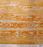
The texture of woodgrain is implied by this Authentique paper. Placing a smooth paper against this paper would create an interplay of contrast between a visually smooth and a visually rough paper.


Value
Value is the interaction of lightness and darkness, and includes black and white, as well as all colors in between.

These  7 gypsies and Theresa Collins papers illustrate a large contrast between the values of the colors selected.  Squinting your eyes at papers laying next to each other is a way to see if they have similar or different values.


Space
Space includes the area an artist works within as well as the size of objects within the work. Size is the relationship of the area of an object in comparison to another. Space may indicate two or three dimensions.  The way you would use space is different if you are working on a 12x12, 8x8, Card, or Artist Trading Card. Being aware of the space of the work allows appropriate design decisions to be made.

Over the next few weeks, we will play with the Elements of Design.

Thursday, October 6, 2011

Thrifty Thursday: 6X6 Paper Pads

I am all for saving money when it comes to scrapbooking. I'll admit that I used to be intimidated by 6x6 pads of paper because I had no idea what I was supposed to do with them since I am not much of a cardmaker. But when I relaxed my standards of what products a perfect layout could be made with, I realized that 6x6 pads were a quite thrifty way to make layouts.

You can by 36 or so sheets of 6x6 papers for about $5. I challenged myself to make layouts using only 6x6 papers with the exception, of course, of the background paper. Here is what I came up with:


I made this layout with the Cosmo Cricket Social Club and Upcycle 6x6 pads, which I paid $4.50 each for. I used a total of 6 different sheets of paper.

I also made a layout for Authentique Paper recently using their 6x6 paper line, Free Bird.


As you can see, this layout was inspired by the last layout I created. This is the Authentique Free Bird Fair-Weather collection and I absolutely love it. It is the first textured 6x6 paper I've ever seen!

This is another Authentique layout I created using the Blissful and Uncommon 6x6 pads. I was inspired by an illustration I saw on Pinterest to create a solar-system-type layout.


I figure that 6x6 pads are perfect for making embellishments. I used my various flower punches to make layered flowers here. The small patterns of 6x6 papers work really well for small embellishments.

The last layout I have to share with you is based upon a sketch done by a guest sketcher, Lisa Zubritsky, for Scrapbook Steals. I used Crate Paper Emma's Shoppe and Portrait 6x6 pads and Sassafras Ellie's Tale 6x6 for this LO.


As you can see, it worked out perfectly to have smaller patterns for this LO since I was just cutting up smaller pieces of paper. I actually felt kind of relieved since most often, it kills me to have to cut into a full sized piece of paper for such a small piece.

I would love to see what you all create with 6x6 pads. If you feel so inclined, please put a link to your projects in the comments so we can all come and check out what you made.

Thanks for stopping by!

Tuesday, October 4, 2011

Color Challenge #1:

Welcome to Woodgrain Mustache's first Color Challenge!! It's Heather!! 

This week, I am pulling a pin off of Pinterest to use as the challenge for this week. Fall is quickly coming upon us all... But I am still pining for the summer that really never was in the Great Northwest. Hence the summer berries, and fall colors.


Here is my version of these colors!


Each week one of us will be showing a color combination, your goal is to link your work that uses that color combination in its entirety. You may use white, black and/or kraft as needed... You can use the image as inspiration, but it is not necessary.  Have fun, and link away!
*******

Sunday, October 2, 2011

Featured Designer... Chloe Salerno

Featured Designer...

It is my honor to kickoff our weekly guest designer feature with our own Chloe Salerno! Chloe is super-talented,and has a fun, colorful style that I just adore. But please, don't take my word for it, check out her blog!

I'd like to share one of my favorite layouts that Chloe has made. Look at those colors! Please share some love for Chloe, she's gonna be dropping in with a personal post this week.

Saturday, October 1, 2011

Journal Prompt Sunday--- Love Story

Welcome to the first ever challenge here on Woodgrain Mustache. I am so excited about this little foray of ours, and it is my hope that you all will be inspired to participate. The key is that this is supposed to be fun. This challenge blog is designed to get us all excited about creating, while breathing new life into our work.

Today, I've come up with a journal prompt for you to interpret in any way you desire. You can make a layout or mini album, or even a card or altered item (although with a journaling prompt, that might be a tad more difficult ;) ). Your assignment is to tell a love story. You can tell the story of how you and your significant other met, or go back in time and tell the story of your parents or grandparents. You could even go in a completely different direction and journal about your love affair with Starbucks (oh wait, that would be me).

My plan is to make a layout about my daughter's recent obsession with her stuffed animal, Scout. Harper is nearly 18 months old and has never really had any security items, as hard as I've tried. I have given her stuffed animals, blankets, pacifiers and everything has failed to stick until now. Scout is not just any stuffed animal. He is a personalized dog from Leap Frog that sings songs with her name and her favorite color and favorite food. Harper will ask to take him along when we go in the car and she will tote him into stores. It's just about the cutest thing I have ever seen.

I will work on my layout today and post it here as soon as I am finished. I hope you all will consider this prompt when you sit down to scrapbook next. If you do make a layout using this journal prompt, please link it up using the inlinkz below. We would all love to see what you make.


Welcome to Woodgrain Mustache!!

Welcome to  Woodgrain Mustache!

Today we begin a great adventure! We, the lovely ladies of Woodgrain Mustache (WM) are planning on dazzling you with various ways in which to not only jumpstart your creativity, but find new ways in which to share your work with others.


We are simply a group of crafters, who love sharing our knowledge, passion, and love of creating with others. Each of us hope that you will add to our community by reading and sharing your work. We hope to create daily, and inspire often.

Tomorrow starts the first challenge for WM! Our weekly schedule for October is as follows:

Sunday: Journaling Prompt
Monday: Featured Artist
Tuesday: Color Challenge
Wednesday: Wild Card Wednesday
Thursday: Thrifty Thursday
Friday: Friday Design School
Saturday: Step-by-Step Saturday

If you would like to add our blinkie to your blog or web page, please do!! 


Make sure that you link the image to http://woodgrainmustache.blogspot.com/

Our goal is to post daily, so make sure that you check back each day for challenges, information and new projects!